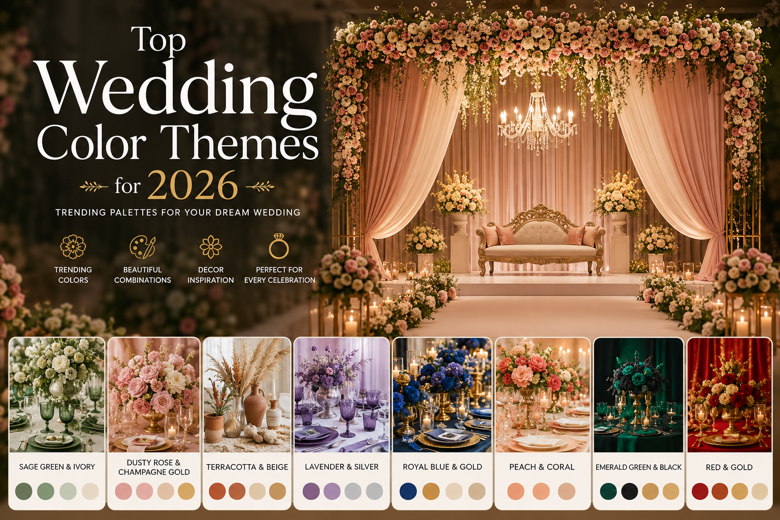
Top 25 Wedding Color Combinations That Look Luxurious in 2026
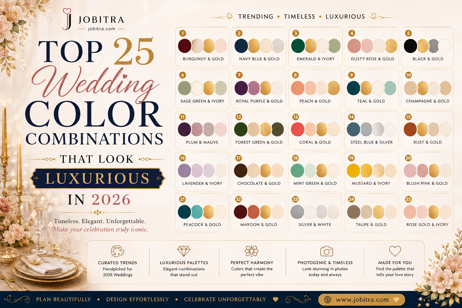
Top 25 Wedding Color Combinations That Look Luxurious in 2026
There is something about choosing your wedding colors that feels almost as nerve-wracking as choosing the venue. I mean — once those colors are locked in, they show up everywhere. The invitation. The lehenga. The mandap. The dupatta your dad wears. The flowers, the table linen, the tiny brass diyas. So yes, it matters. A lot.
If you are planning your big day for 2026 and you want it to feel genuinely luxurious — not the kind of luxury that screams, but the kind that quietly takes your breath away — this is the only color guide you will need. I have put together 25 of the most stunning wedding color combinations I keep recommending to couples this season, with honest notes on when to use each one, what they pair with, and the moods they create.
Why Your Wedding Color Palette Matters More Than You Think
Your palette is the invisible thread holding every visual moment together. Think about the last wedding you attended that felt put-together — the kind where every photo looked like it belonged in a magazine. Chances are, the color story was tight. Two or three hero shades. A neutral. A metallic. Done.
When the palette is muddled, even gorgeous decor starts to feel busy. When it is focused, even simple decor looks expensive. That is the entire secret. Now let us get into the colors.
1. Maroon and Antique Gold — The Forever Classic
If there is one combination that has never gone out of style in Indian weddings, it is maroon and antique gold. It carries weight. History. That deep, almost velvet-textured maroon you see on a Banarasi saree, paired with the warm, slightly tarnished feel of antique gold — together they look like a royal wedding from a forgotten Rajput era.
Best for: Traditional Hindu weddings, evening ceremonies, North Indian families, winter weddings.
2. Dusty Rose and Champagne — Modern Bridal Romance
Dusty rose has quietly taken over Pinterest, and for good reason. It is romantic without being cloying. When you pair it with champagne (not gold — there is a difference), you get this hushed, expensive softness that looks incredible in daylight photography.
Best for: Daytime weddings, garden venues, second-marriage celebrations, intimate weddings under 200 guests.
3. Emerald Green and Burnished Copper
This is the combination I recommend when a couple tells me they want their wedding to feel "different but not weird." Emerald is rich and confident. Copper warms it up and keeps it from feeling cold or corporate. Together, they read like the inside of a luxury Mumbai bar — moody, plush, grown-up.
Best for: Engagement parties, cocktail receptions, urban venues, couples who hate pink.
4. Blush Pink and Rose Gold
Yes, it is everywhere. Yes, it is still beautiful when done well. The trick is restraint — too much rose gold and the whole thing starts to look like a teenager's Pinterest board. Use rose gold for accents (cutlery, lettering, candle holders) and let the blush do the heavy lifting.
5. Royal Blue and Silver
There is a reason royal blue has never really left wedding palettes. It photographs beautifully against Indian skin tones, and silver gives it a coolness that gold cannot. This combination works especially well for Sikh weddings, sangeet nights, and any function where you want a "starry sky" mood.
6. Mustard Yellow and Powder Blue
The Haldi power couple. These two colors are made for each other — warm and cool in perfect tension. You see them everywhere on Instagram now, but they still feel fresh because most people are still doing them poorly. The trick is balance: 70% mustard, 30% blue, with white as the third grounding color.
7. Ivory and Burgundy
Ivory is the most underrated bridal color in India. It is softer than white, warmer than cream, and pairs beautifully with deep burgundy. This combination feels like a winter wedding in a heritage haveli — quietly grand, never loud.
8. Lavender and Sage Green
Gen-Z is pushing this combination hard, and honestly, they are right. Lavender feels modern and slightly dreamy. Sage green grounds it so it does not feel too "girly." Add brass or matte gold for warmth.
9. Peach and Coral with Hints of Aqua
The destination wedding palette. If you are planning anything in Goa, Kerala, or coastal Maharashtra, this is your color story. It looks incredible in sunset light and translates beautifully into floral arrangements.
10. Wine and Nude
This one is for the brides who want something deep and sensual without going full traditional. Wine is sophisticated. Nude is forgiving. Together they create a palette that looks expensive without trying.
11. Pastel Pink and Mint
Best for spring weddings or morning haldi functions. There is something fairytale about it — almost like cotton candy, but elevated. Add white peonies and you have a dream.
12. Deep Teal and Gold
Teal is having a moment, and I am here for it. It looks royal without being predictable. Pair it with bright gold (not antique this time) and you get something that feels both modern and ceremonial.
13. Black, White and Gold
Hear me out — black at an Indian wedding is no longer taboo, especially for receptions and cocktail nights. Done right, with crisp white linens and gold accents, it reads like a luxury Mumbai gala. Best for evening receptions only.
14. Terracotta and Cream
The most underrated combination on this list. Terracotta is earthy, warm, almost sun-baked. Cream softens it. Together they look like a Tuscan vineyard wedding — but they also work beautifully for South Indian temple weddings.
15. Magenta and Marigold
If you want a wedding that screams celebration the moment guests walk in, this is it. It is the palette of an Indian summer — loud, joyful, unapologetic. Best for outdoor venues and daytime functions.
16. Plum and Champagne
Sophisticated, romantic, and forgiving in photographs. Plum is darker than burgundy, more interesting than maroon. Champagne keeps it light.
17. Forest Green and Burnt Orange
Autumn wedding palette. Earthy, romantic, slightly bohemian. Pairs beautifully with wooden furniture and pampas grass installations.
18. Sky Blue and White
Perfect for morning weddings and brunch receptions. Clean, airy, easy to photograph. Add silver or pearl accents for sparkle.
19. Rust and Olive
Trending hard with destination wedding planners. It looks incredible in golden hour photography and pairs beautifully with copper utensils, jute table runners, and wildflower bouquets.
20. Coral and Navy
An unexpected combination that just works. Coral brings energy, navy adds depth. This is the palette for couples who want something traditional-adjacent but not predictable.
21. Soft Yellow and White
The minimalist haldi palette. Clean, fresh, photo-friendly. Add a few marigold accents and you are done.
22. Mauve and Dusty Blue
Romantic and slightly vintage. This combination works beautifully for sangeet nights and pre-wedding cocktail parties.
23. Pure Ivory and Soft Gold
The minimalist luxury palette. If you want your wedding to look like a Chanel ad — this is it. Restrained, elegant, photograph-friendly. Pair with white tuberose and pampas.
24. Ruby Red and Onyx Black
For the couples who want drama. Black accents in florals, table runners, and lettering — paired with ruby red roses and gold candle holders — create a wedding that looks like a Sabyasachi campaign.
25. Sand, Sage and Soft Pink
The boho luxury palette of 2026. Three colors, all muted, all natural. Looks incredible in daylight and works beautifully for destination weddings.
How to Pick the Right Color Palette for Your Wedding
Here is my honest framework — the same one I walk every couple through:
- Start with your skin tone. Your wedding palette will appear in 80% of your photographs. Pick colors that flatter you, not just Pinterest.
- Consider your venue. A marble palace already has its own color story. A garden venue is a blank canvas. Pick palettes that complement what is already there.
- Think about the season. Summer weddings call for lighter palettes. Winter weddings can hold deeper, richer tones.
- Limit yourself to three colors. Two hero colors and one neutral. More than that and the palette gets muddled.
- Test it on your invitation first. Your wedding invitation is the first place guests experience your color story. Get it right there and the rest will follow.
Color Trends That Will Define 2026 Weddings
If you are watching trends carefully (and you should be), here is what I am seeing dominate the 2026 wedding season:
- Soft, muted, sun-faded palettes are replacing bright jewel tones for daytime weddings.
- Earth tones — terracotta, sage, rust, sand — are everywhere on Pinterest.
- Metallics are getting softer. Antique gold and matte brass are in. Shiny gold is out.
- Monochromatic palettes (different shades of one color) are having a moment.
- Black is finally being embraced for receptions.
How Your Wedding Invitation Sets the Color Tone
Here is something most couples forget: your wedding color palette officially begins the moment your invitation lands in someone's WhatsApp. Whatever color story you build into your digital wedding invitation sets the expectation for every guest. So if your invitation is dusty rose and champagne, but your venue is bright red and gold, you have a disconnect.
This is why couples increasingly create their entire color palette on their wedding invitation website first — pick the colors, the typography, the mood — and then let the decorator match. It is the modern way of planning.
FAQs About Wedding Color Combinations
Which wedding color is luckiest for Indian weddings?
Red and gold remain the most auspicious combination in Hindu traditions — symbolizing prosperity and new beginnings. But maroon, deep pink, and orange carry similar cultural weight without the visual heaviness of pure red.
Can I use black at an Indian wedding?
For receptions and cocktail nights, yes — and it looks stunning when done right. Most families now accept black for evening functions, especially in metropolitan cities. For traditional ceremonies, it is still rare.
What colors photograph the best for outdoor weddings?
Soft pastels, dusty rose, sage green, terracotta, and ivory all photograph beautifully in natural light. Avoid neon shades and pure white if you can — they tend to overexpose.
How do I match my mehendi, haldi, and wedding colors?
Pick one anchor color that runs through all three functions in different intensities. For example, peach for haldi, deeper coral for mehendi, and burgundy for the wedding — all from the same color family.
Final Thoughts
The best wedding palette is the one that feels like you. Pinterest will not tell you that. Your decorator will not tell you that. Even your mother will not tell you that. So sit down, look at the colors that already live in your life — the saree your grandmother wore, the walls of your favorite cafe, the sunset from your terrace — and start there.
And when you are ready to bring that palette to life, start with your invitation. Build it on Jobitra.com, choose a template that matches your color story, and watch the rest of your wedding fall into place around it.